Challenge
TaylorMade incorporated ‘back-office’ booking and ordering functionality into its fitting application. Because of the scale of the project, mobile functionality was also requested by the fitters who work with Tour Pros.
Result
Faster club changes, accurate shot tracking, and improved data capture, enhancing the sales process. It enables swift signup management, eliminating sync delays and ensuring a seamless golfer experience with the auto-sync feature.
Strategy
After an NPS Survey and a thorough audit of the fitting app and the back-office functionality and user flows, I created an updated styleguide for the new app. The new app is optimized for mobile, higher-contrast for outdoor use, and incorporates functionality to be a stand-alone event booking, fitting, and ordering app.
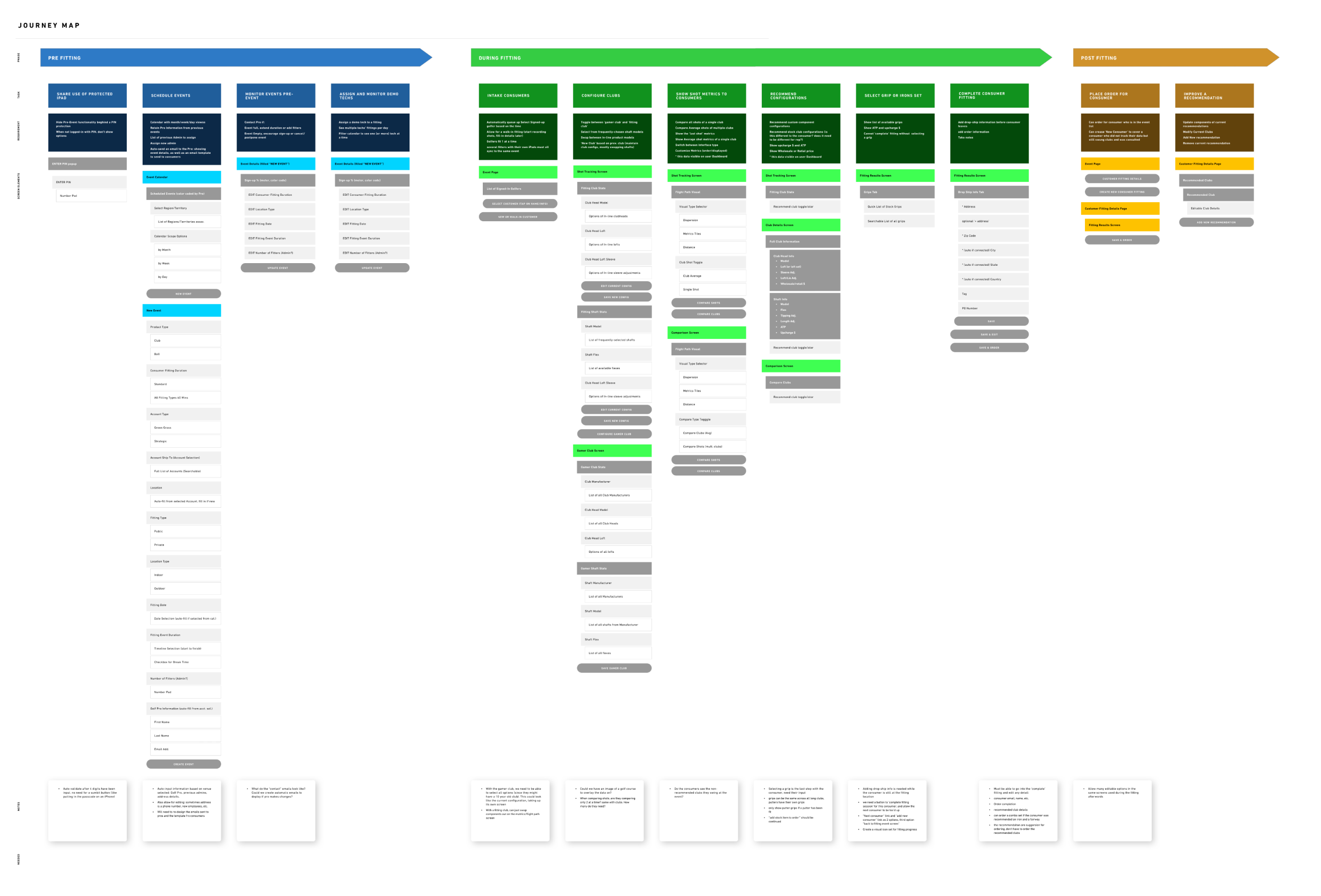
Documentation of the user flow through the back-office, the MFE app, and B2B ordering software. This project integrates the functionality of all three into the tablet/mobile app.
Event Management on the range
With the new calendar functionality, fitters can create and manage fitting events within the app, allowing them to be more nimble on the range.
Often, consumer intake is not planned, and people walk on for a fitting. This functionality allows fitters to quickly onboard new consumers without missing important contact and demographic information.
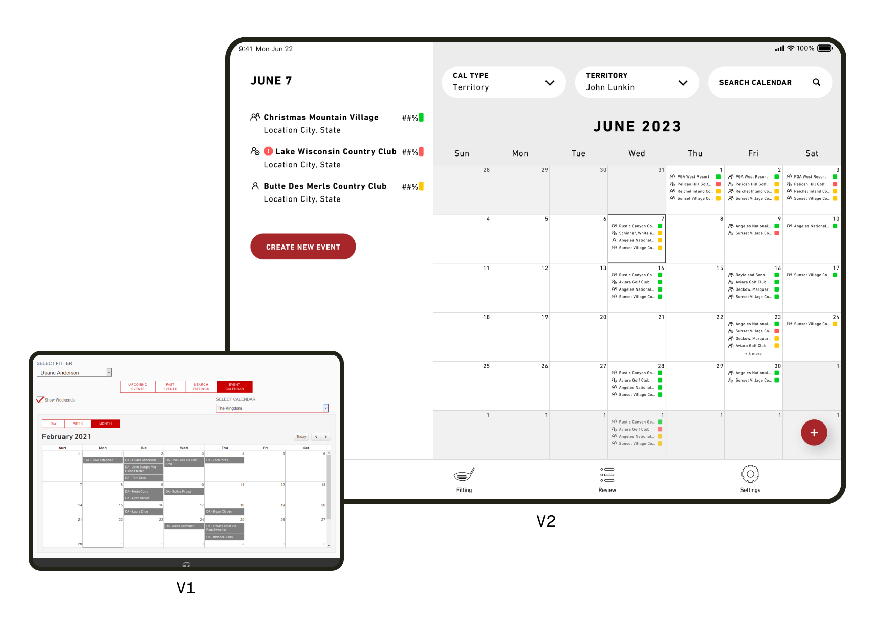
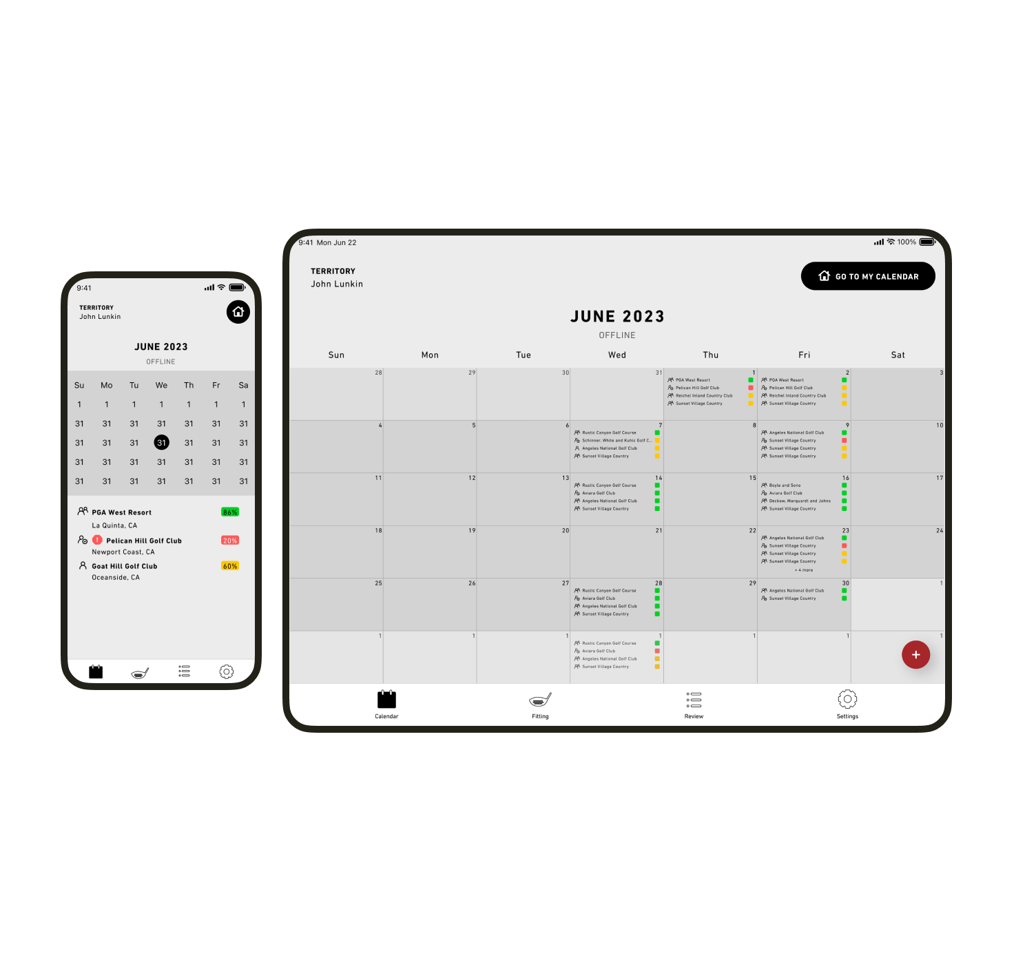
Online vs. Offline
To start, it is important that fitters can access the calendar at all times and know at a glance if they are connected to Wi-Fi or not.
The calendar, while offline, can display past and present events, allow the creation of new events, and can be used to view event details. Fitters are aware that the information may be out of date until connected to Wi-Fi again.
Quick-reference UI
Reps may manage a large swath of fittings across multiple territories. They requested some kind of visual cue that could easily convey the health of a fitting and the type of fitting.
I used the classic "Stop-Slow-Go" color scheme to communicate how booked an event is, and an icon system to denote the type of fitting.
This allows fitters to quickly scan their calendars and find problematic fittings.
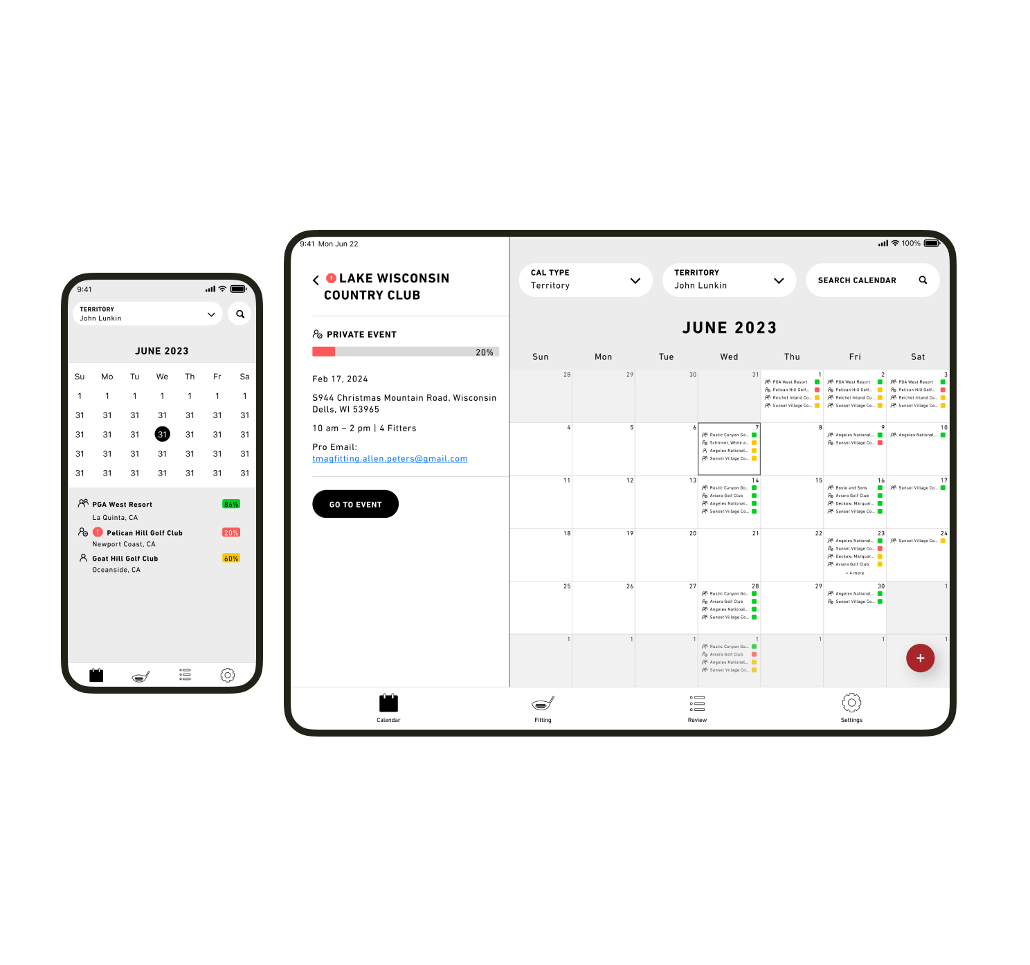
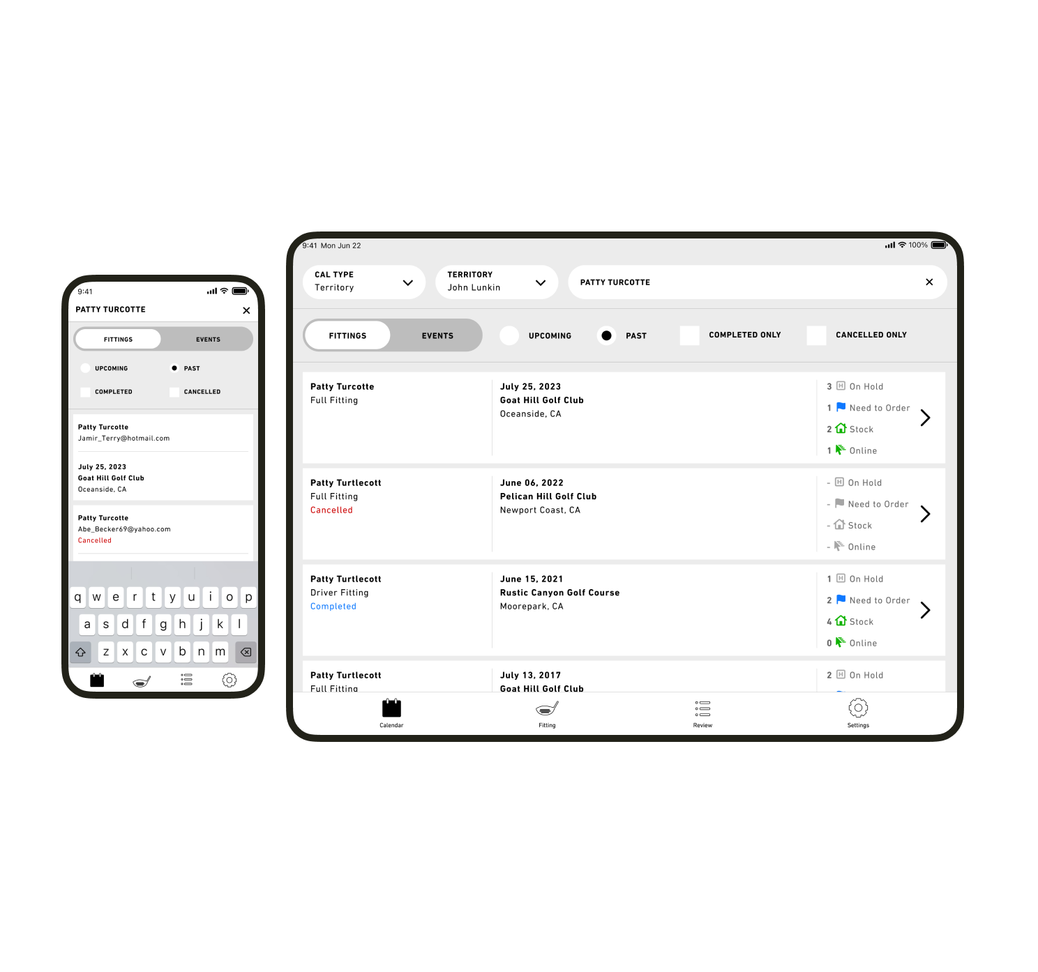
Searchable History
Often, fitters will want to reference a consumer’s past fittings to get a sense of their history.
Because we added booking and calendar functionality to the fitting app, fitters can quickly search for and leverage data about their customers.
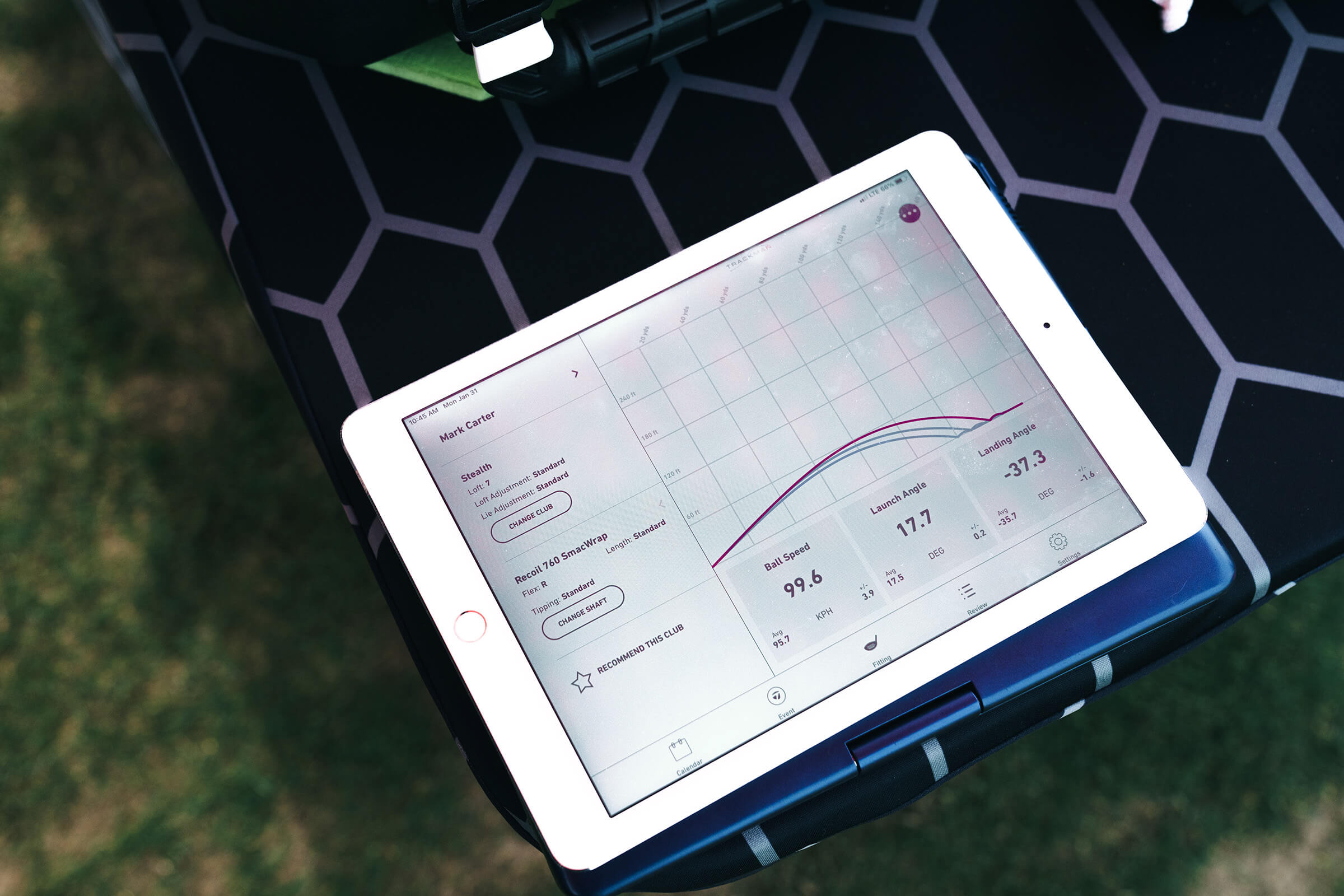
Focus and Visibility
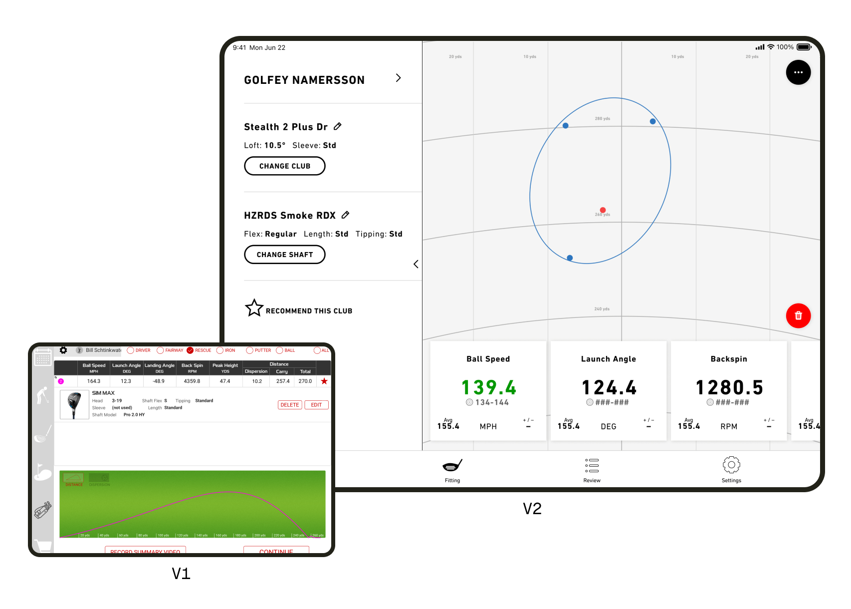
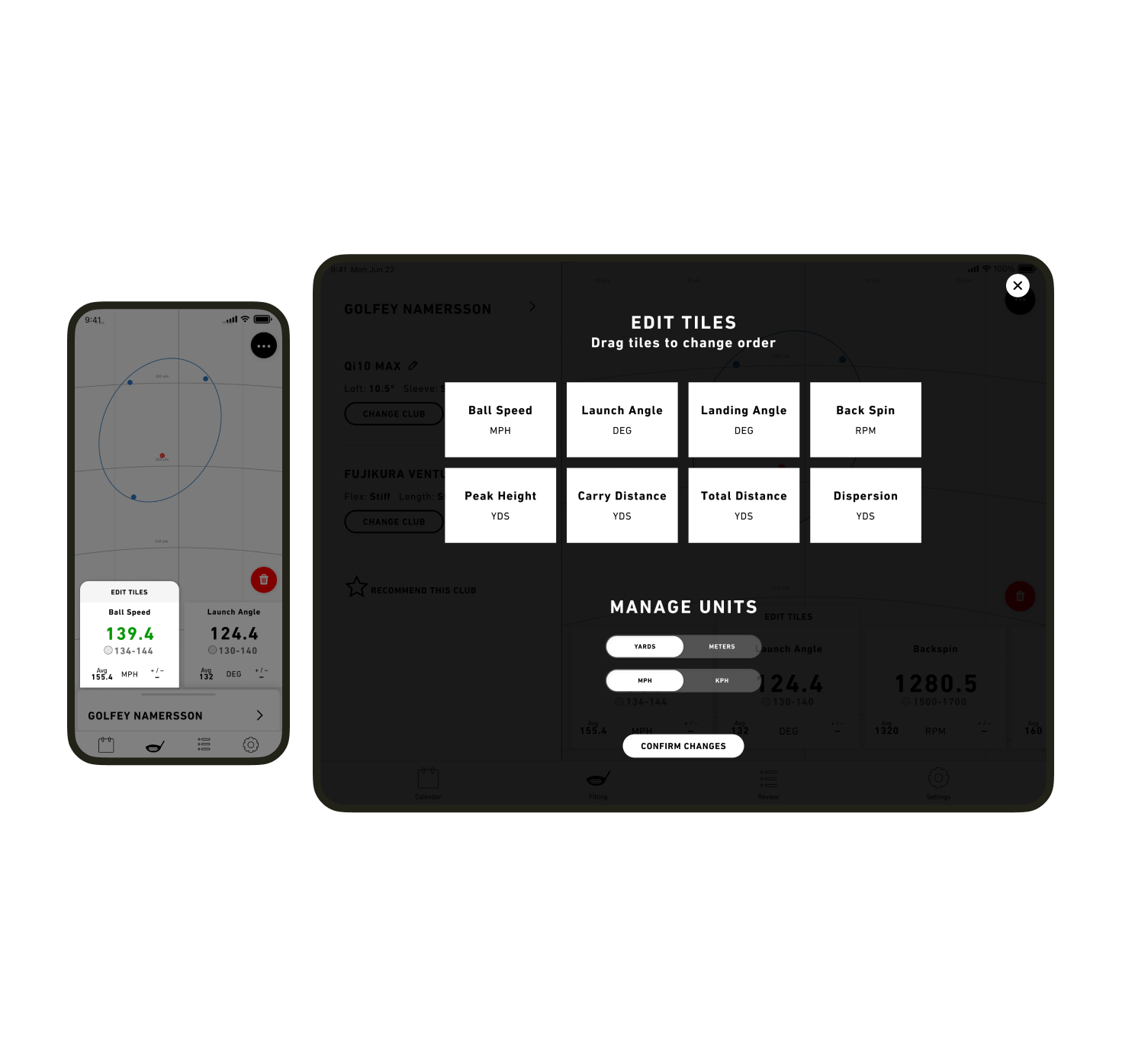
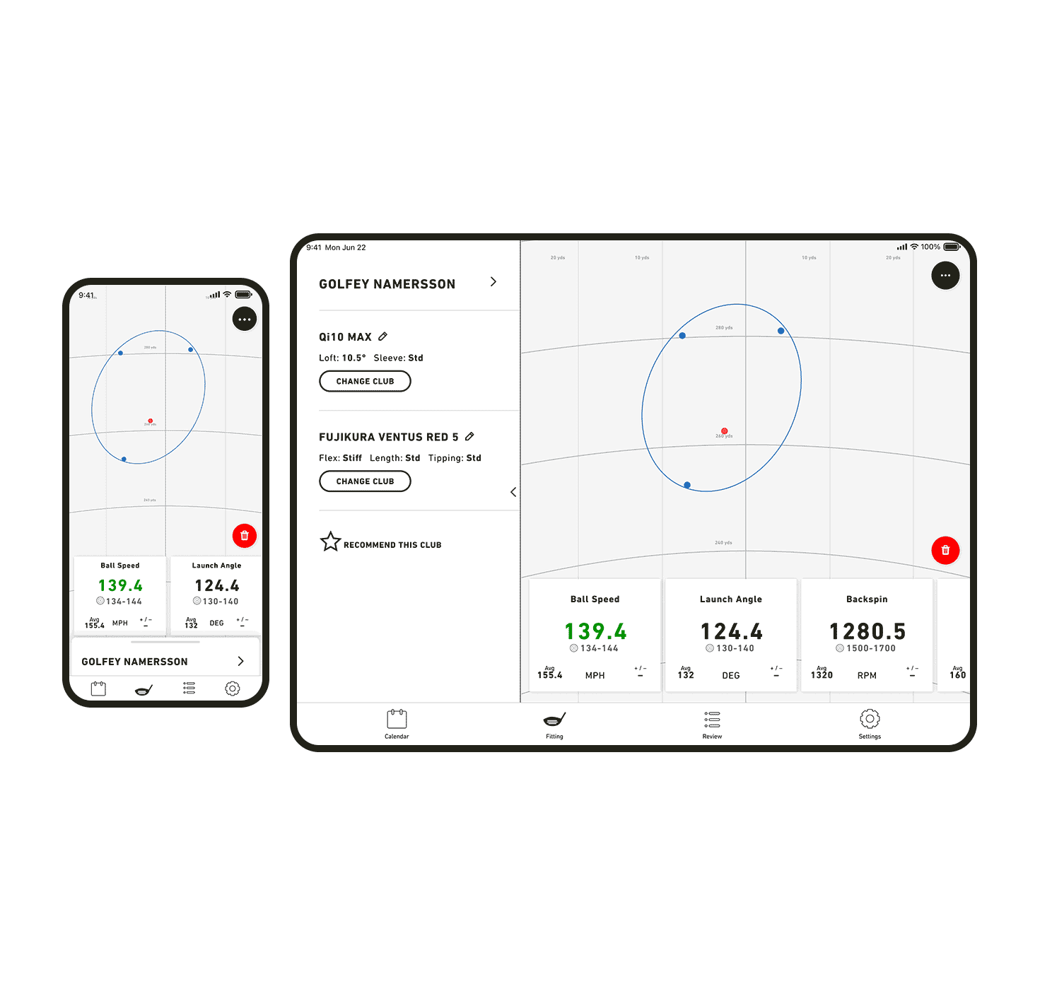
The new interface focuses on displaying shots and important metrics chosen by fitters. The user community wanted the ability to highlight key metrics for their customers and control how the data is presented.
User interviews suggested the majority of fitters highlight 2-4 key metrics to explain their process to consumers.
Metrics based on consumer
Not all fittings are the same, and each fitter depends on different metrics to decide what shafts and clubs will be best for the consumer.
I designed a gesture-based action to allow fitters to re-sort the metric cards quickly during the fitting to suit their needs.
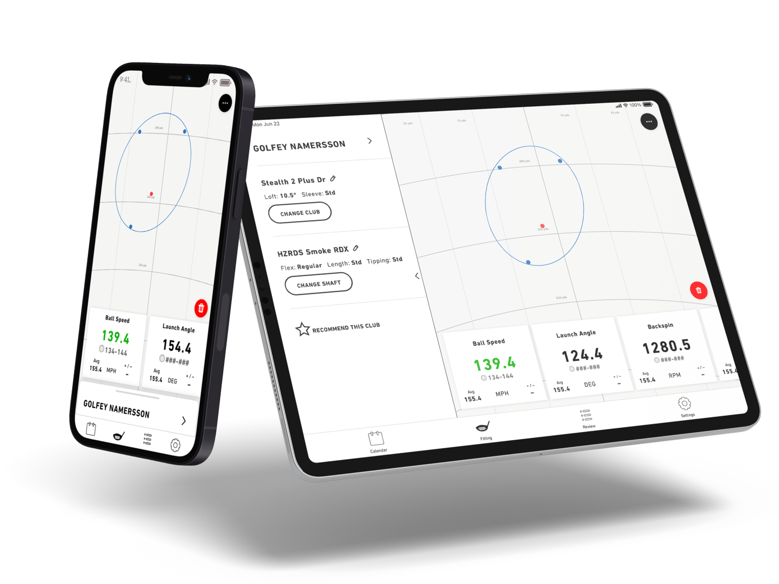
Collapsible Drawer
The new layout includes a left-side drawer that contains details based on the context of the users actions.
The drawer is collapsible, allowing the fitter to show metrics to the consumer.
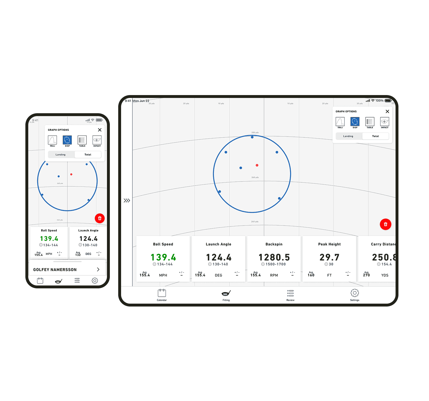
Multiple graphs for a complete data story
Surveys mentioned that a dispersion view was more important to fittings than the distance graph. We defaulted fitting graphs to Dispersion, and incorporated a graph menu for fitters to quickly switch between the styles depending on the need of the moment.
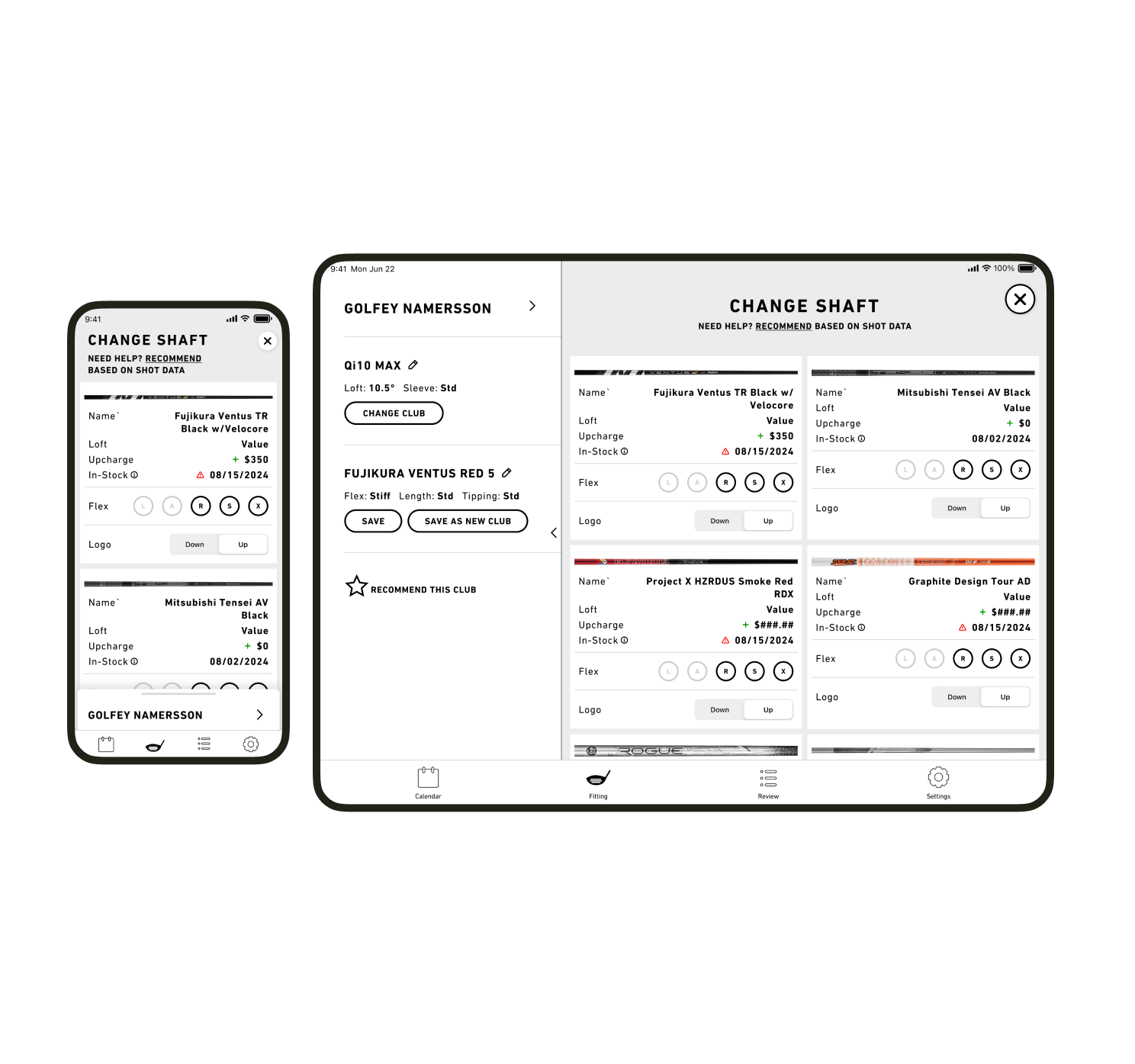
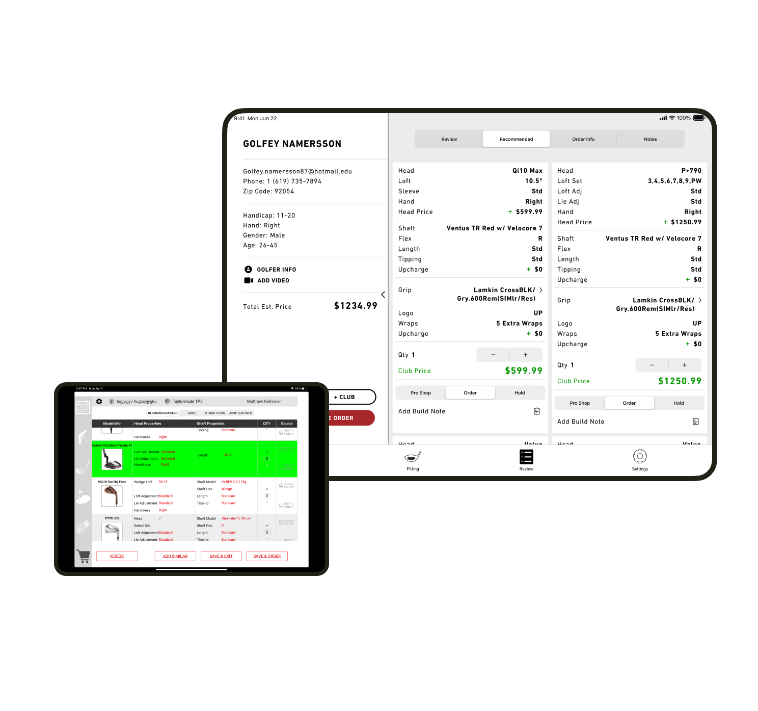
Unencumbered configuration
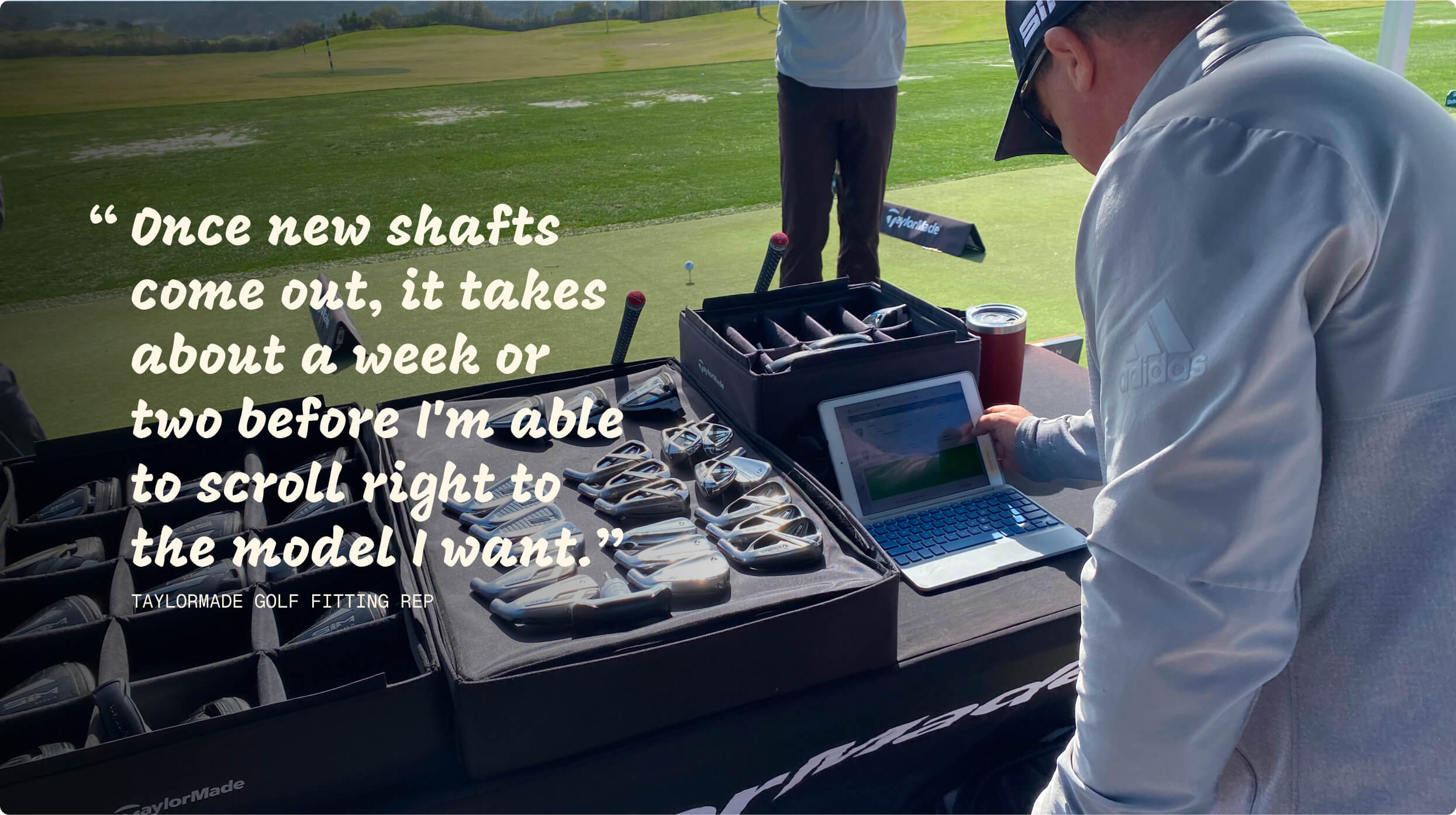
One of the biggest complaints in the NPS survey was the action-cost of configuring a club. Every option was hidden in a series of out-of-date roulette wheels.
During an interview, a fitter told me it took him two weeks or so to be able to find the right components within the small roulette wheel once the new season’s gear came out.
The V2 design’s focus is on easy component swapping and simple club configuration.
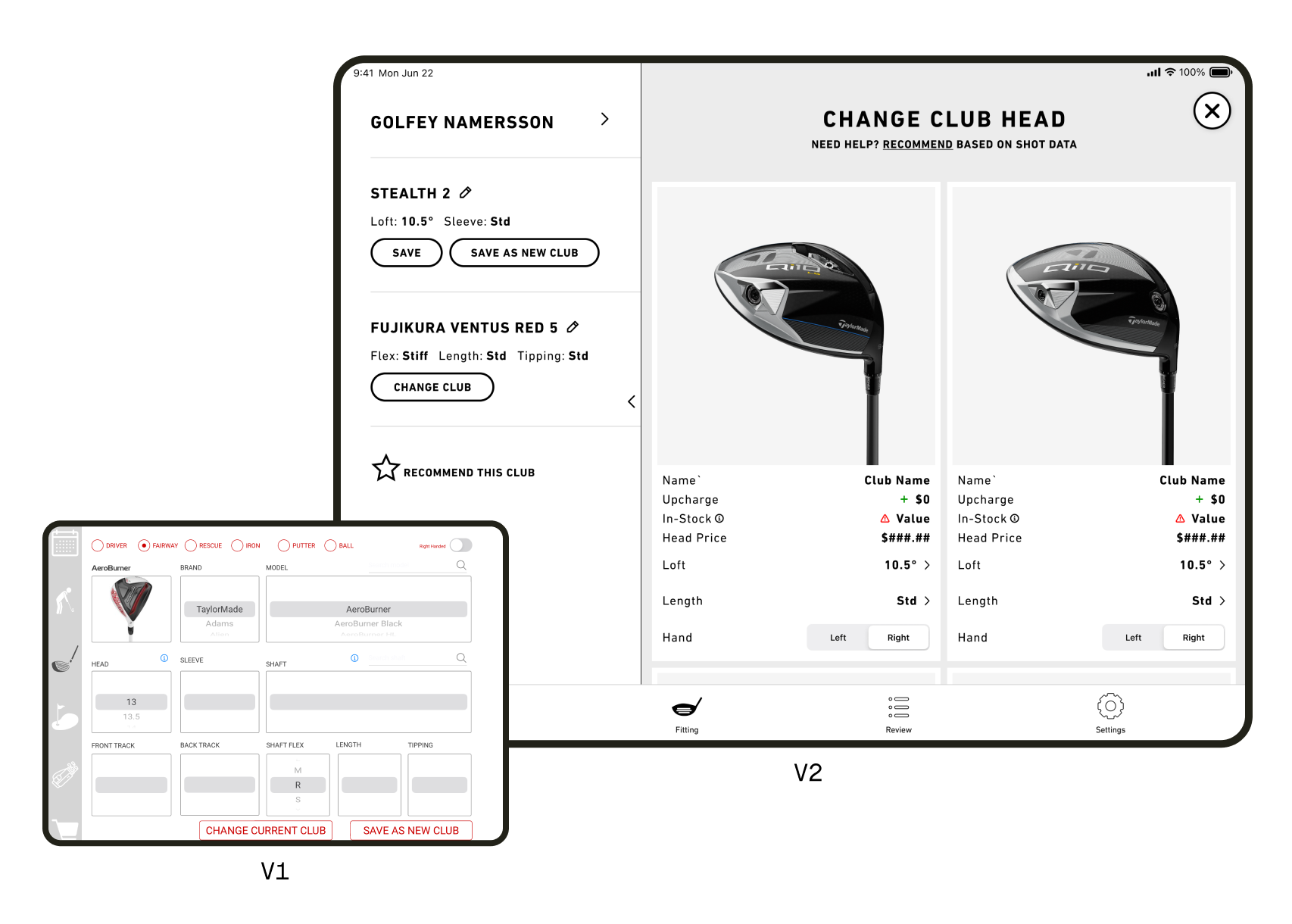
Tile-Based UI
Rather than configure a shaft or grip by navigating through a series of dropdowns or roulette spinners, I designed V2 to function through tile cards.
Fitters found it easier to navigate the component configurations with each component represented by a separate tile.The tiles change format depending on the user action, adding UI elements for the order process.
Top Ten List of Components
Through data research and user interviews we found that the majority of consumers are fit into one of ten shaft models.
The shaft list is configurable by the reps to feature the top ten shafts from their fittings. After that, there is a manual shaft search to bring up rarer models.
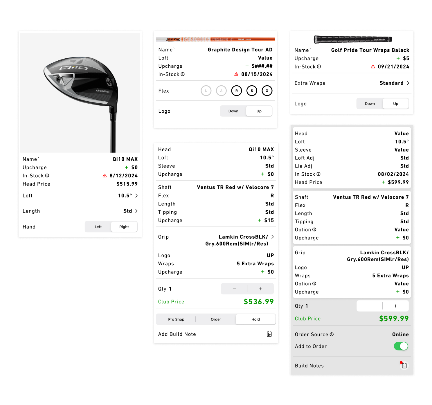
Review & comparison
Before creating an order for the consumer, the fitter will show the consumer their summary and recommend club builds for them.
The old layout was difficult to navigate and forced the fitters to alter the flow of the fitting to work on the app, causing empty fields and notes on paper going missing: The new UI is designed for the fitter’s needs, increasing overall use of the app.
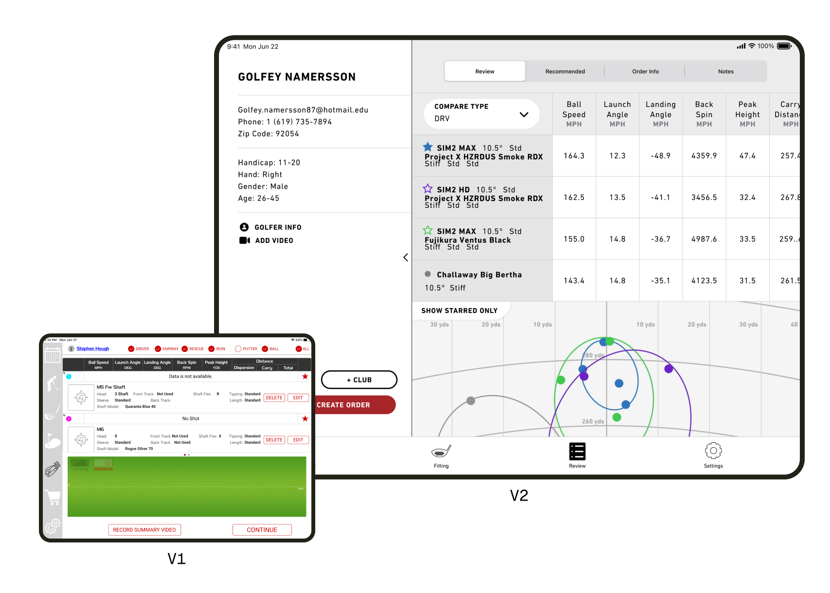
Recommendations
I designed the new review screen to enable fitters to see a summary of the recommendations as well as make choices about order source, add stock products, and create notes for club builders.
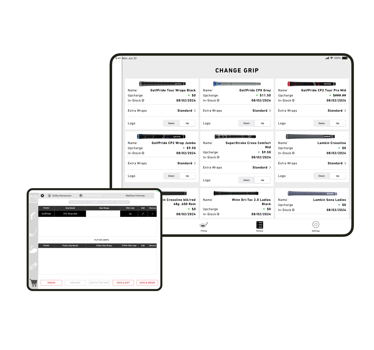
Grip and Stock Product
In the flow of a fitting, choosing a grip is the last step, almost an afterthought. It was reflected in the UX of V1.
I suggested defaulting to the stock grip for each club, with the ability to choose a custom grip in the review stage. This was a necessary step in de-cluttering the review and order process.
I re-used the “Change Grip” UI and flow for adding stock product as well, like golf balls or gloves.