Challenge
Many golfers believe club fitting is only for the pros. Fittings can be lengthy, expensive, and, frankly, embarrassing for the average golfer. We created a data model that can intake user shot data and deliver a club recommendation based on that data.
Result
After reviewing the data and refining the design, the SmartFit Studio has been a hit with investors and consumers. After rigorous internal and public testing, we’ve moved forward with deploying this experience run by external teams.
Strategy
We conducted 50 or so internal in-person test runs, 5 in-person public events, created a user survey to be filled out post-experience, and have deployed three stations at golf ranges across southern California to continue gathering data.
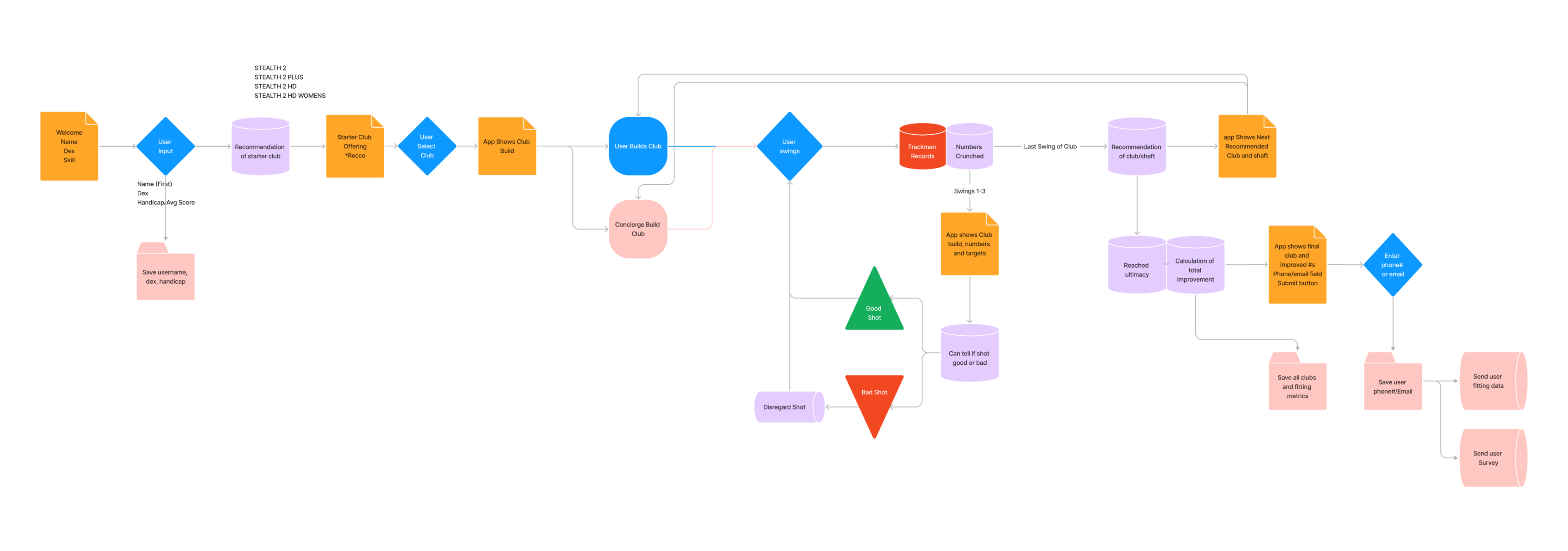
At the onset of this project, I worked alongside our data engineers to determine how and when we could leverage the database to validate users' shot data.
This process was a tightrope walk, with ease-of-use on one side and utmost recommendation accuracy on the other. Our trial period over the past year has validated the balance we landed on as valuable to users.
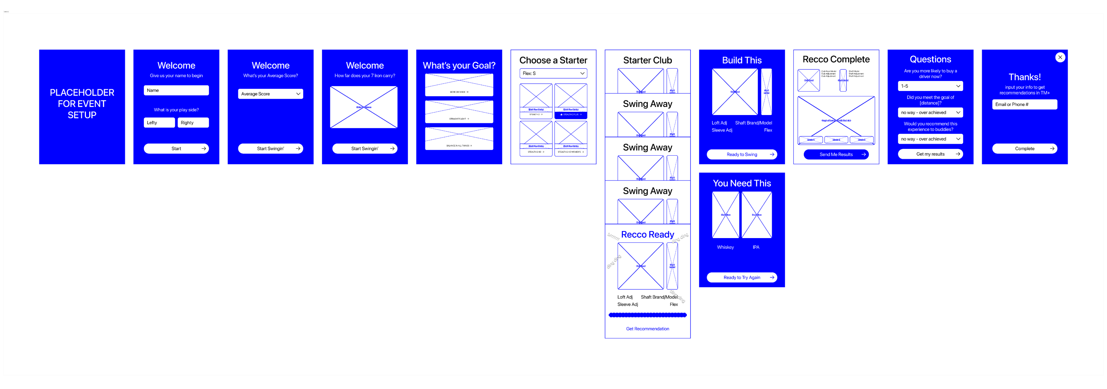
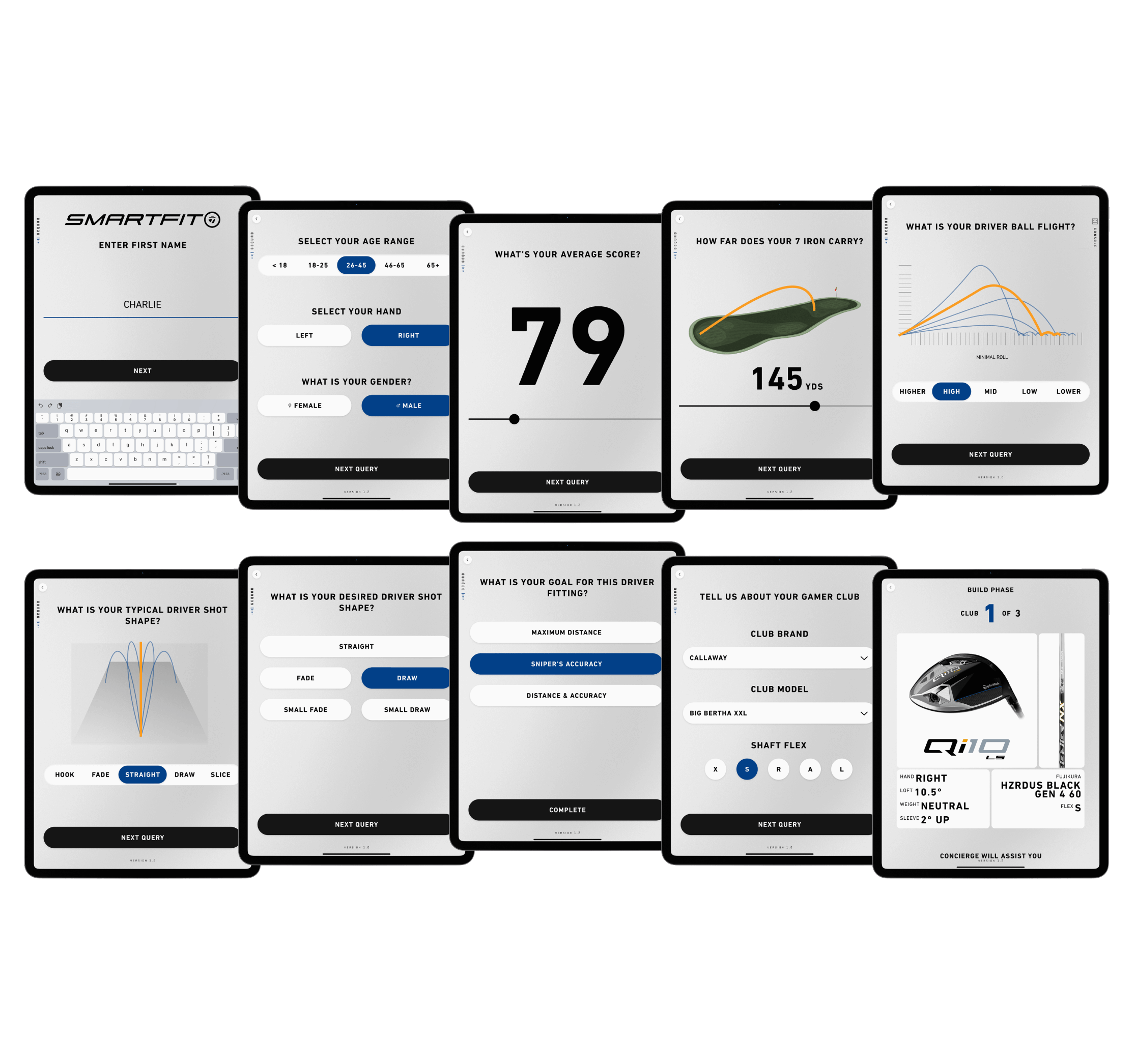
There are 2 modes of user interaction with this app. The first is the onboarding questionnaire, which gives us the initial condition to recommend the first shaft and clubhead combination.
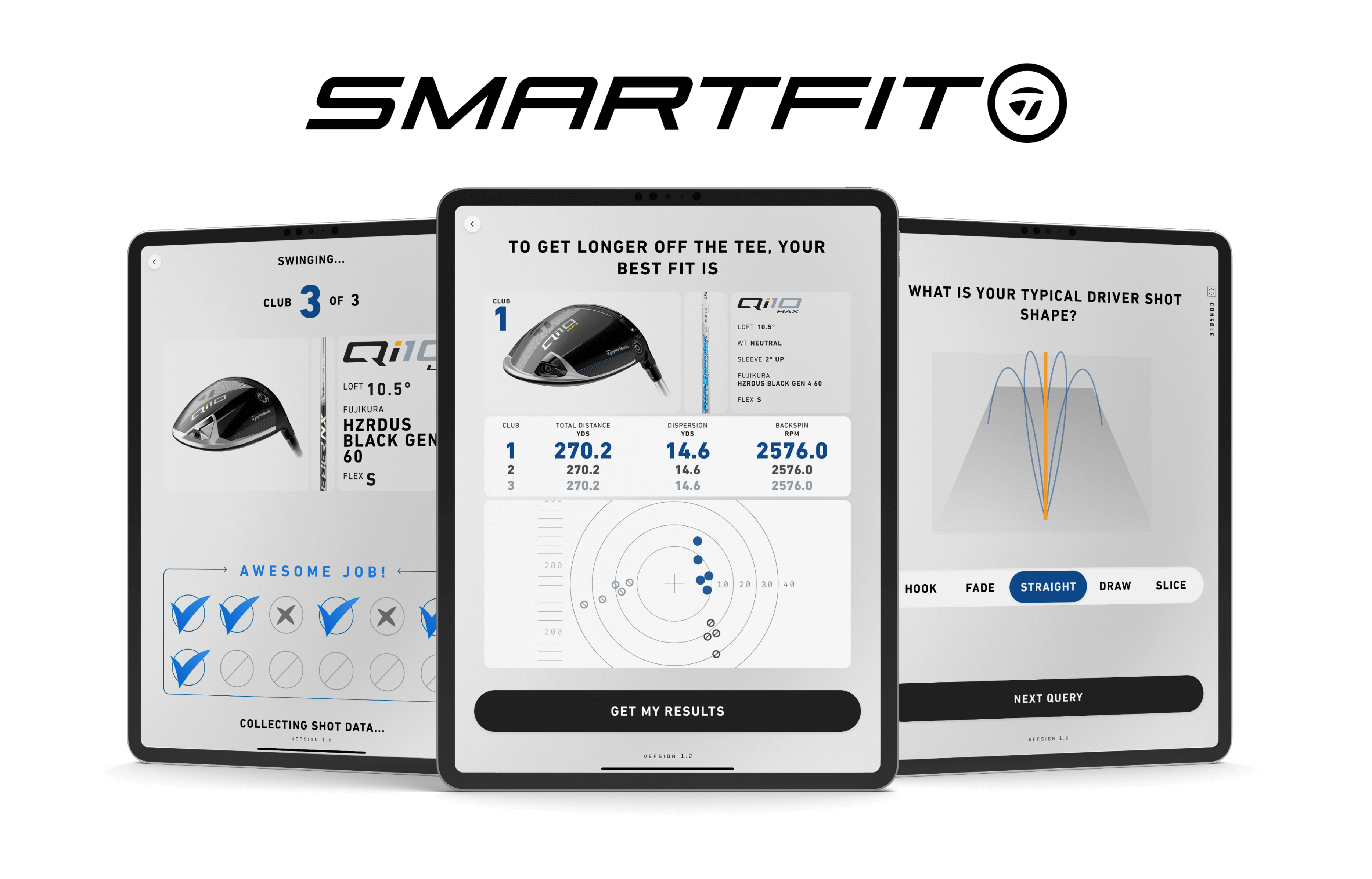
The second mode is the swinging portion, where the user receives a club from the on-site concierge and swings between 5-12 shots. Then our model can map their swing characteristics and recommend a new build to conform to their ideal swing shape and their goal of accuracy vs. distance.
Onboarding for ideal initial condition
While there are nine questions in total, we determined that the length of this interaction was worth it for the accuracy of the first recommendation: it’s better for the user to answer three extra questions than to swing three extra clubs!
All in all, it takes an average of two minutes to get through the onboarding, a fraction of the 20–25 minute fitting experience.
inaccurate self-reporting
During observation and subsequent reports from concierges, we found that users were tapping “OK” through the questions, giving us bad data for our initial condition.
To correct this behavior, I set the default answers from a Selected Average Ability to an Unselected Bad Golfer Ability. We’ve seen this lead to more varied answers, which we take as users inputting more accurate data.
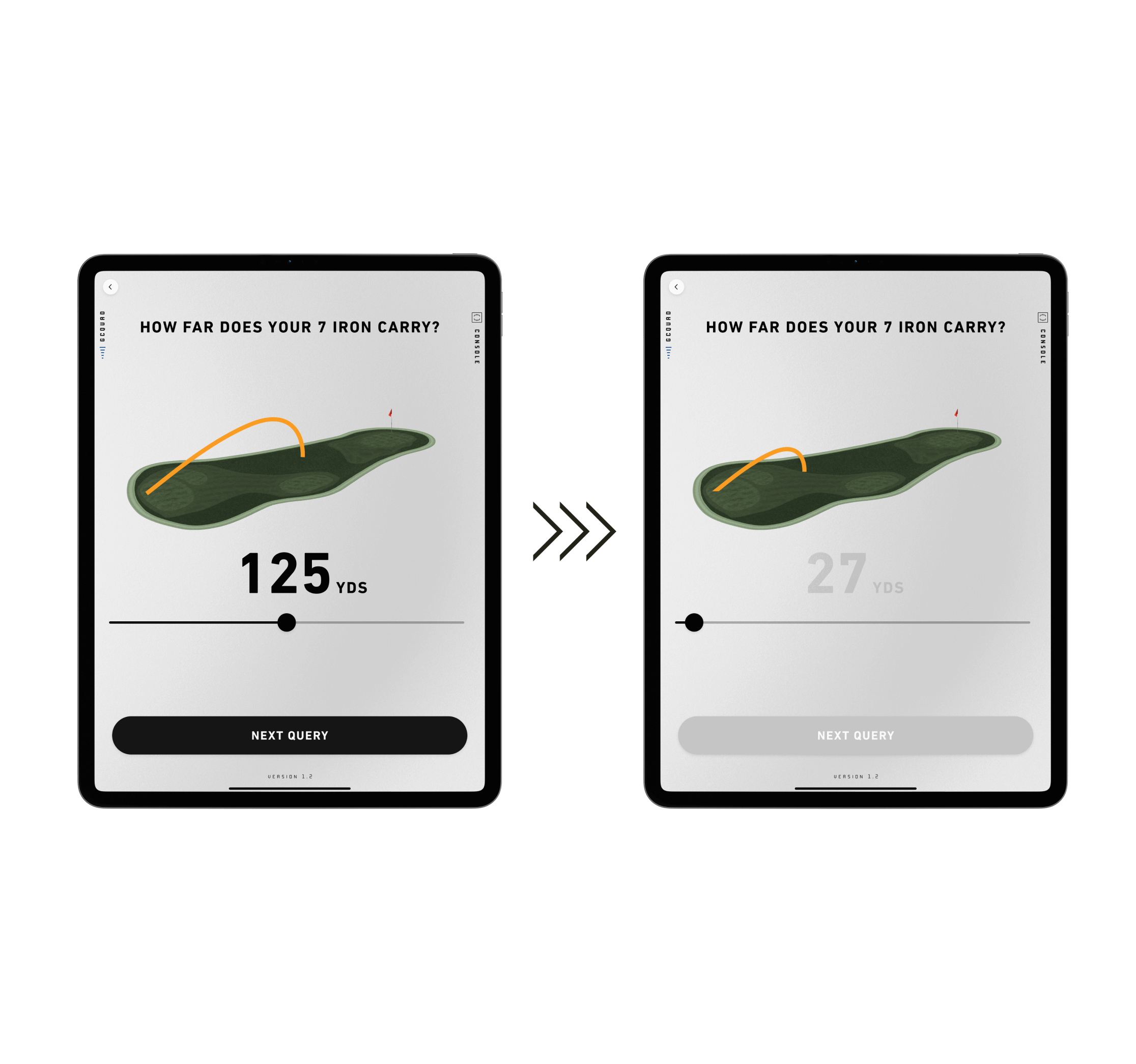
Communicating a “Good” vs. “Bad” Shot
Through observation and in-person interviews, we found that many high-handicap golfers were getting frustrated with how many swings they had to take in order to get a recommendation.
Because our model needs several swings to create parameters to determine if the shots are “bad” or “good”, we were limited in being able to declare the quality shot-by-shot.
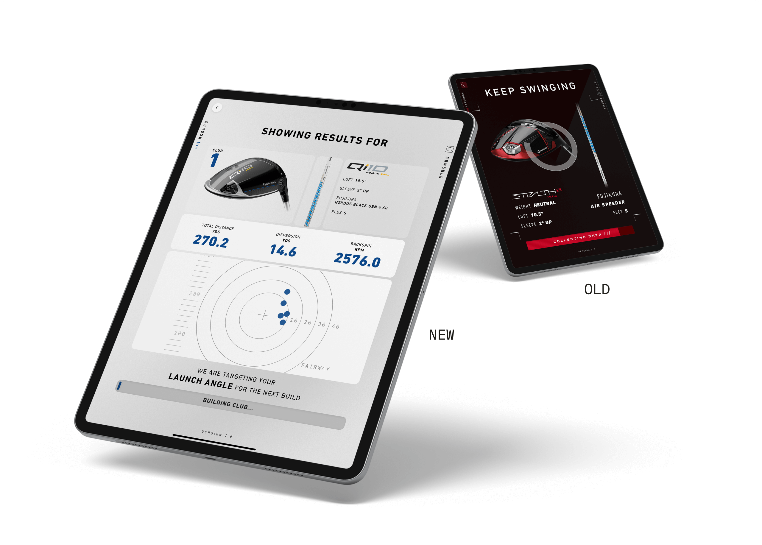
Increasing User Waypoints
We worked with our engineers to create a shot-validation system that had a minimum of 5 shots and a maximum of 12.
We can now show the users how their shots rate after the first 5, rather than a hidden countdown. We’re currently testing to see if a maximum of 8 will still return a sufficiently accurate club build.
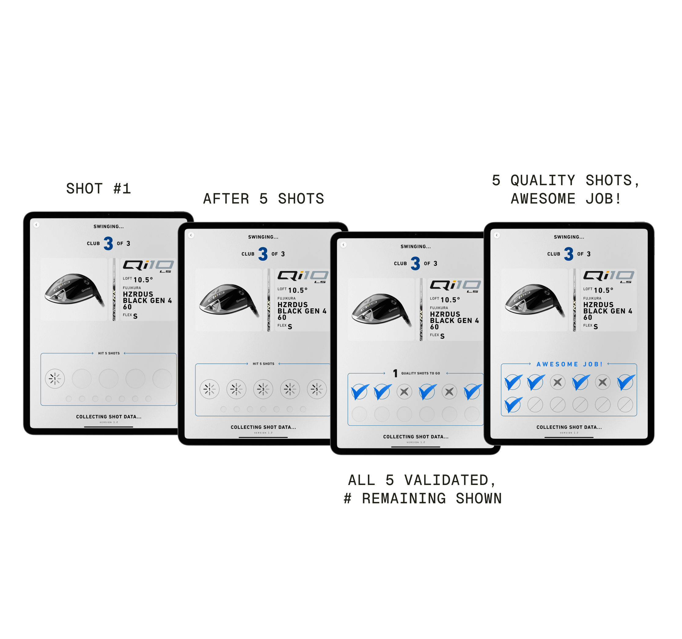
After 10 rounds of internal testing, we identified four areas of the swinging mode that needed improvement.
Users were finding it difficult to rely on memory to distinguish between each club they hit. We needed to open up the ‘black box’ we initially believed would be sufficient. People needed to know why we were recommending what we were.
After implementing these changes, user surveys indicated greater trust in the final recommendation and more willingness to pay for the experience.
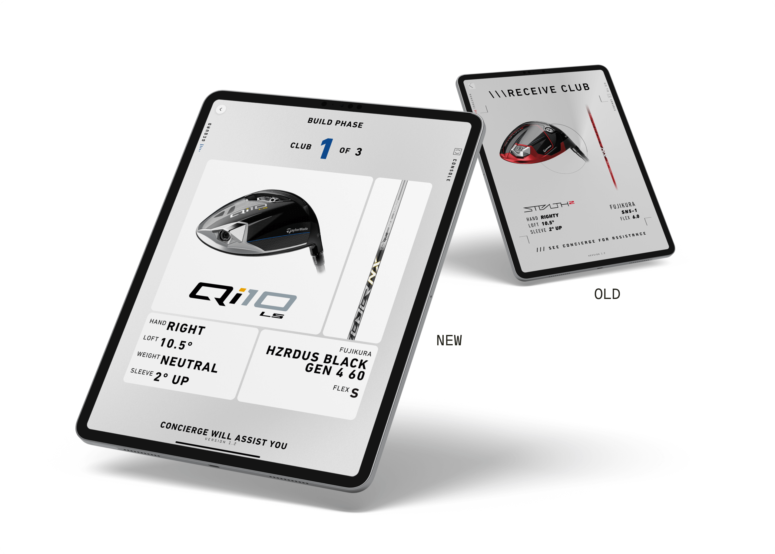
Adjusting the build phase screen
We added a simple identifier to each club for user reference (club 1, 2, 3), making it easier to create a mental map of the experience.
I also increased the size of the components and club specs for the concierge to better see from a distance while building the club.
Since it is an outdoor experience, I increased the contrast of the component and specs words for greater visibility.
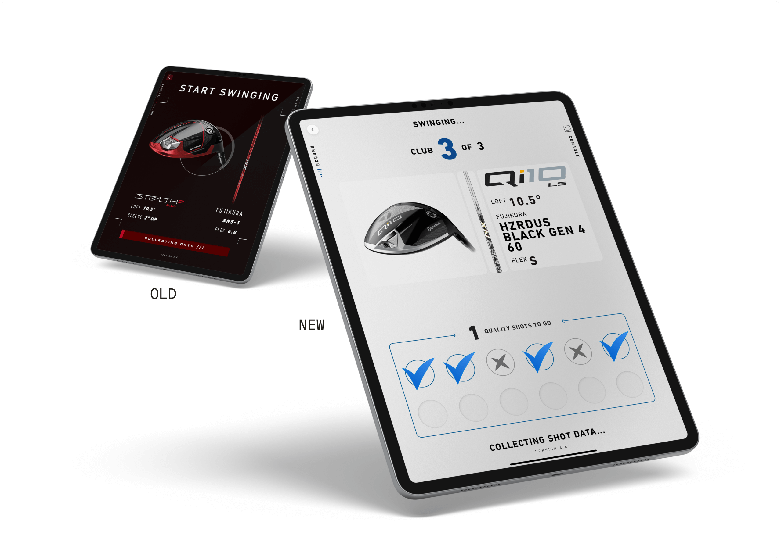
Giving users stronger wayfinding
Users were uncertain about the number of swings required for the next recommended club, often becoming frustrated and sweaty on the range.
I worked with engineering to create an interface that shows per-shot validation and expected maximum shots.
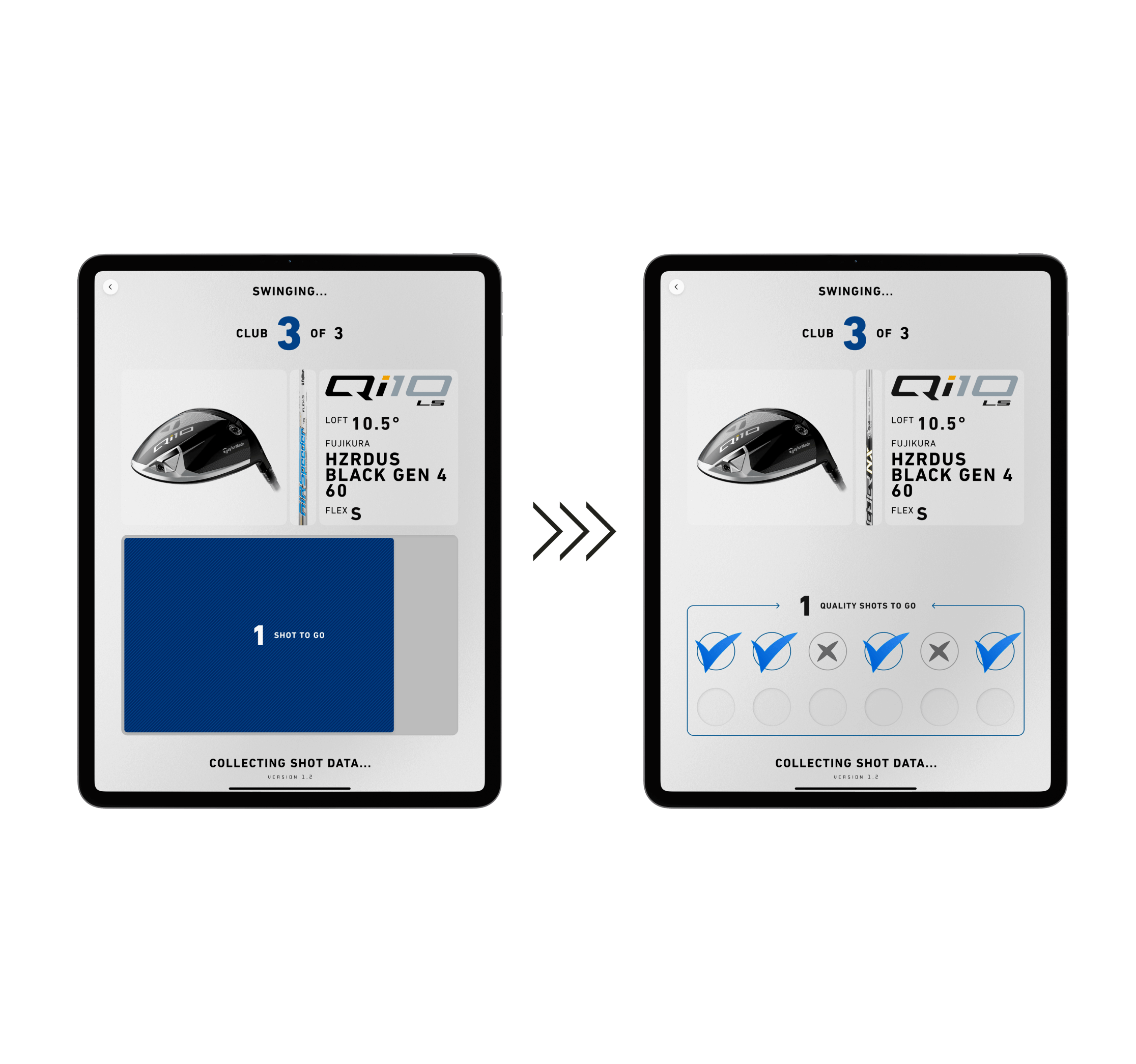
Per-Club Shot Mapping
An additional method to eliminate the 'black box' effect was to display the metrics of each club the user swings.
We also exposed some of the data model by telling the users what metrics we are looking to improve, such as launch angle.
With this context, new testers expressed greater satisfaction with the end result and developed a higher level of trust in the overall experience.
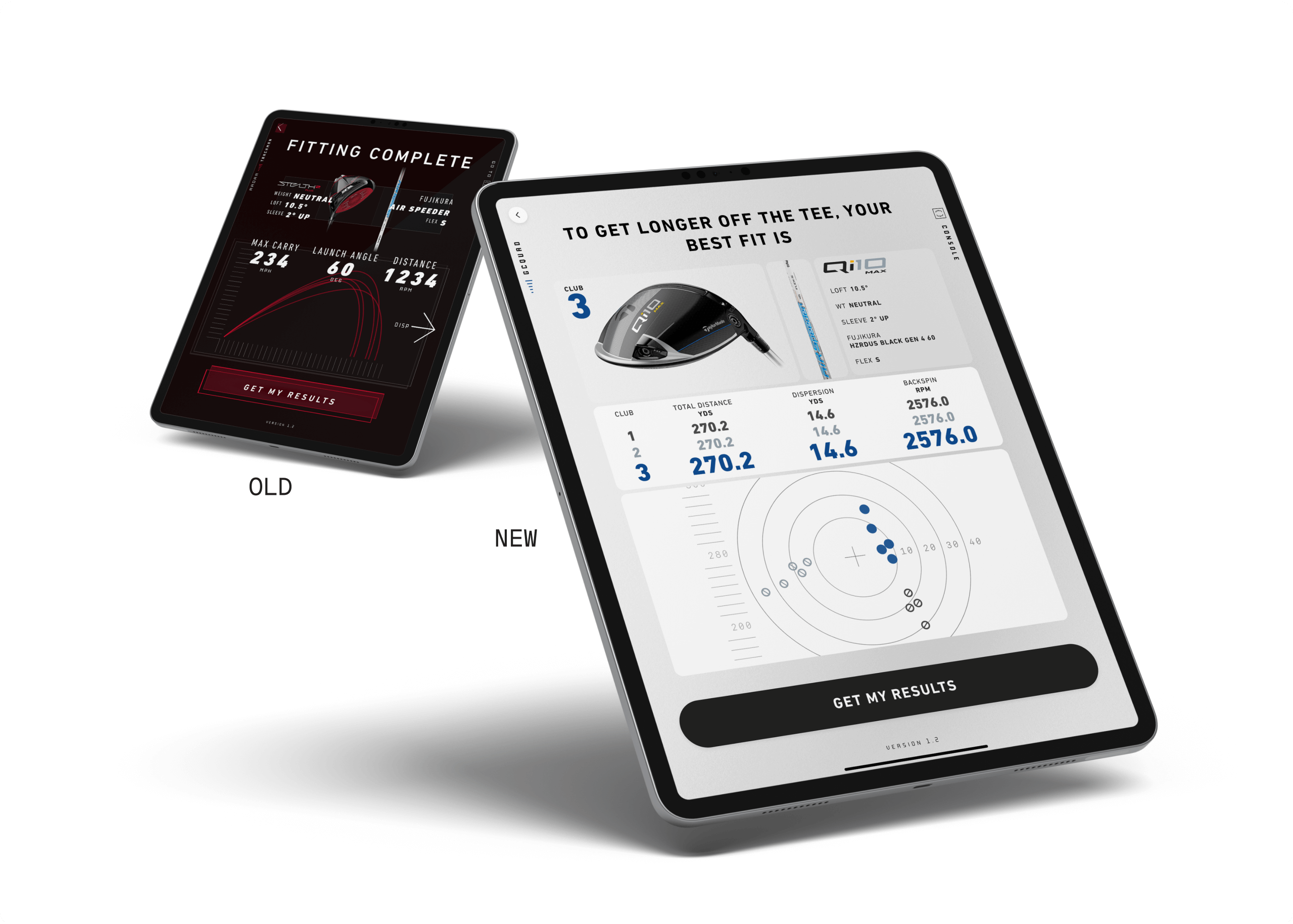
Final Recommendations
After collecting survey feedback from our initial test users, I added a summary of all clubs hit on one screen.
Users can now fully grasp the nature of the final recommendation and see the average metrics from each club they swung.
Users reported a greater amount of confidence in the final recommendation as a result of this enhancement.
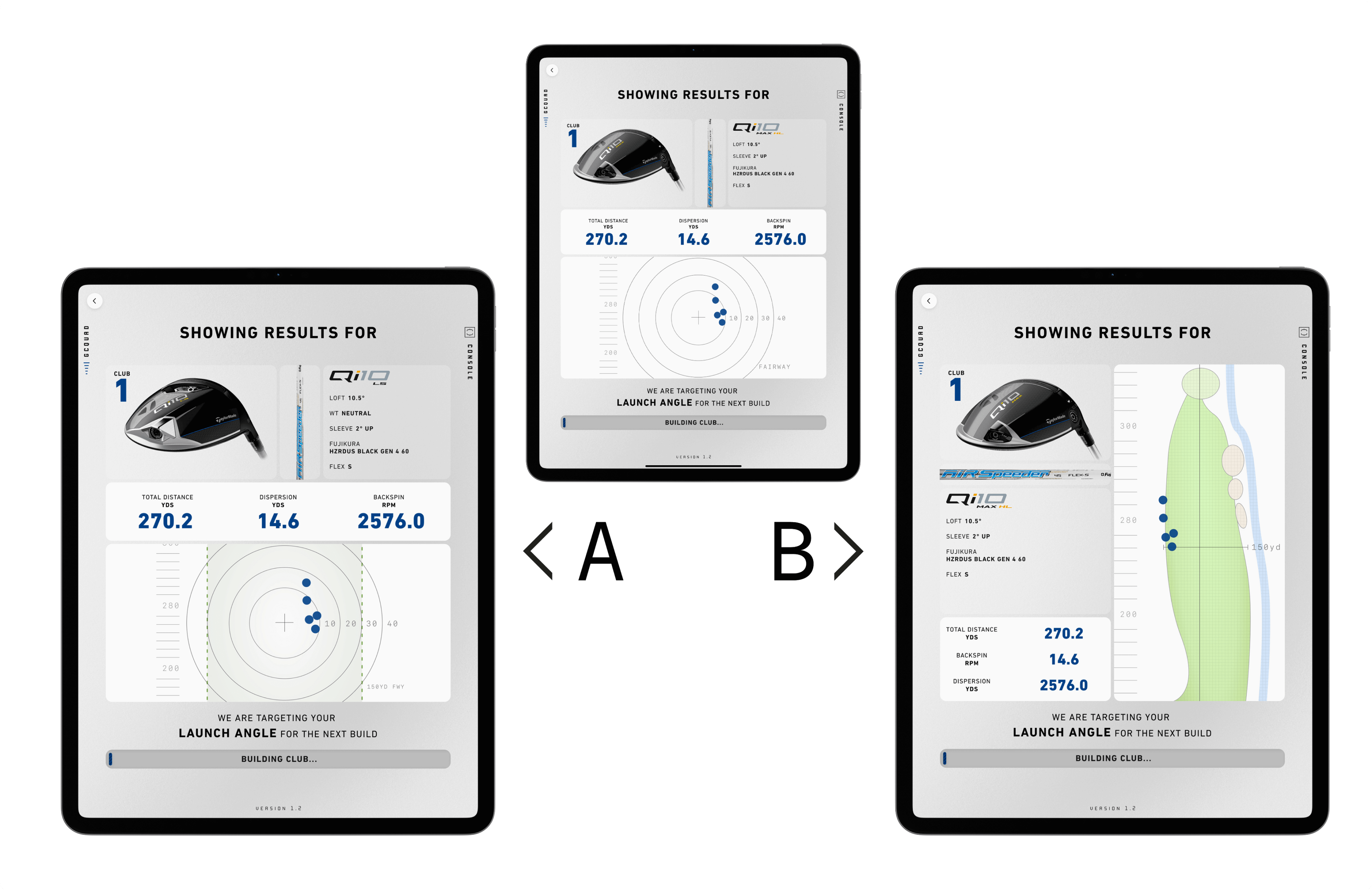
Improvements on the horizon
In addition to the work showcased above, we are still identifying friction points in the user experience and deploying solutions.
We’re currently testing alternate club results screens to provide more detailed shot grouping data to the users.


